UK GDPR: Showing compliance

One of the few things which I felt was different between the old Data Protection Act 1998 and GDPR when it was introduced, was the need to be able to evidence compliance as part of the compliance process.   So, to be compliant you have to be able to provide evidence of compliance. 

So how to show compliance?

As we start a new academic year, I think it is therefore important to give some consideration as to how you can provide compliance with UK GDPR so I thought I would list some of the key evidence you should have.   

Data Record Summaries

One of the key things about GDPR and personal data is knowing where the person data is stored and/or processes so one of the key methods of showing compliance is to have records of which data is where, along with appropriate classification of the data, who has access to it, its purpose and how it is processed.  Now I know from personal experience this can be a very arduous job, however it is important to understand it can be carried out at different levels of details, from full details down to the individual data fields, which is likely to be too details and time-consuming, to higher-level records focussing more on record types.   It is therefore important to decide what level of detail how need.   It may be acceptable to have a high-level central record which individual departments then may keep more detailed records at a more local, department level.

Retention periods

We also need to be able to show we have considered our retention period of different record types.   Now the Department for Education provide minimum retention periods for some record types however for others’ schools will need to make this decision for themselves.    As such the evidence of compliance is then the retention policy or process plus the fact the current data stored matches this.

Policies

We can also evidence our compliance by having the appropriate policies in place, although really, it is less the policies that matter, and more that the school follows and complies with their own policies.  So, this can include a privacy policy, data protection policy, acceptable usage policy, data retention policy and information security policy.    I think, also there needs to be evidence in the form of policies or documented processes in relation to incident management and in relation to managing subject access requests or other data issues.

Is Data Protection and GDPR discussed

This to me is the most important evidence.   We can create our policies and other documents as a one-off task however data protection and compliance with UK GDPR is an ongoing process, as processes and systems change, as additional data is gathered, as the operating environment changes, etc.    As such one of the key pieces of evidence is that data protection is often discussed.   This can easily be seen in minutes of meetings, briefing documents, emails, incident and near miss logs, etc.    Simply asking random staff some basic data protection questions, such as who they would report a suspected breach to, or what to look out for in phishing emails, will help you easily identify is data protection is taken seriously and therefore, how likely that UK GDPR is complied with.

Conclusion

The above is not meant to be exhaustive detail as the reality of UK GDPR is that your approach should be appropriate for your organisation and for the data you store and process, and the methods you use to process such data.    As such I suspect no two schools will ever be the same, although they will certainly have many similarities.

If I was to make one suggestion it would be to ensure that you can show that data protection is part of the normal day to day processes.   There should be evidence of its general and regular discussion as if this is the case, if it is regularly raised and discussed, it is likely you are already well on your way to compliance.

TAGs and Data Integrity

Following on from my previous post regarding Teacher Assessed Grades (TAG) and cyber security, in my first post I focused on mitigation measures around avoiding possible data loss.   In this post I would like to focus on the integrity of data rather than possible loss.

  • Accidental changes made by users with access
  • Deliberate changes made by users not authorised to make changes, such as students.

The are a couple of issues which could impact on the integrity of TAG data:

Dealing with these issues relies on a number of basic principles which ideally should already be in place.

Least Privilege Access

This refers to simply minimising the users which have access, including minimising those users who have write access over those with read only access.   By limiting the permission level provided you therefore limit the users who may accidentally or deliberately make unauthorised changes and reduce the risk as a result.

Linked to the above it is important to fully understand which users have access to which data/systems, with this being routinely reviewed and adjusted to accommodate for staffing changes, role changes, etc. 

A checking process

It is likely you will have a process for gathering the data, with this data then reviewed by Heads of Department before eventually going to Senior Leaders then the exam boards themselves.   It is also important to have a review process to check that unauthorised changes havent occurred along the way and that the integrity of data is retained across the whole process, from collection to eventually supply to the exam boards.

Audit Trails

If we assume, that there is a reasonable likelihood of an accidental or deliberate unauthorised change, the next thing we need to be able to do is to is identify such changes including the user who performed them, and the changes they made.    It is therefore important to consider if the solution we use to store our TAG data has the relevant audit capabilities, whether it is using the audit logs in your Management Information System (MIS) or version history in either Google Workspaces or Office 365.

Conclusion

Generally, when considering cyber security, the important thing is to identify the risks and then identify and employ appropriate mitigation measures.    There is seldom a “solution” in terms of a product or configuration or setup which is perfect, however there is a solution appropriate to your context, your organisations view as to risk and risk appetite.  

It is also important to note that the best approach is a layered approach.   In this and my last post I havent mentioned the use of storage arrays, mirroring of servers and other approaches aimed at either ensuring business continuity or making recovery quick and hopefully easy.    Although these options add to the complexity of the possible approaches, the key is once again to assess the risks in your school’s situation and context, and deploy the solutions which you believe best address these risks within the framework of a risk management strategy.

Time to stop adjusting grades/grade boundaries?

If using an algorithm to adjust marks is unfair, as it has been deemed to be this year, then surely this practice must cease going forward.

The last few weeks have been filled with issues surrounding exam results.   One of these was being how the A-Level results were adjusted from centre assessed grades based on a statistical algorithm.   This was deemed to be unfair as it penalised some students or groups of students more than others.    The lack of equity was clearly evident due to the ability for schools to compare their centre assessed grades with the finally awarded grades.   It was therefore evident how the statistical adjustment, carried out in the interests of keeping results generally in line with previous year’s results, impacted on individual students.  The faces and lives of individual students could be attached to the grade adjustments.  This was deemed unacceptable.

My worry here is that this statistical adjustment has always gone on.   Normally students would sit exams with their resulting score undergoing adjustment in the form of changes in the grade boundaries.   Again, this was done in the interests of keeping results generally in line with previous years results and again some groups of students would likely be penalised more than others.    The grade boundaries changed due to the exam being deemed generally easier/harder.   The focus on the difficulty of the exam meant that seldom did we associate resulting grade changes with individual students; we don’t generally attach faces to this change, yet some students would have received lesser grades than had the adjustment not been carried out, the same as happened this year.    This seemed acceptable, and has been the way things have been done for decades, but I don’t see how this is any fairer that what happened this year.  

Maybe following this years issues, we need to take another look at how we assess/measure students learning and achievement including the associated processes.

Banning Office 365 in schools?

A German state have announced that they are banning the use of Office 365 in their schools citing GDPR reasons (read article here).   The issue arose, according to the article in the Verge, following Microsoft closing their German data centre resulting in a potential risk where German personal data may be accessed by US Authorities.

My view on this is that there has been a certain amount of overreaction on the part of the German state where viewed as a GDPR related action.   I can understand their concerns in relation to unauthorised access to data by US authorities.  This would represent a GDPR risk however it takes a very narrow view of the situation.

A broader view would include the implications for not using Office 365 to store data.   This means that schools are now storing their data locally on servers most likely within individual schools.   I would suggest that the ability of individual schools, school groups or local authorities to secure their local data including appropriate monitoring and patching of servers, etc is likely to be far short of what Microsoft provide in their data centres.  They are unlikely to have the resources, both technology and staffing, or the skills and experience.    As such removing one GDPR risk in relation to potential unauthorised access by US authorities has simply replaced it with another risk being a reduced level of security for data in each school.    I would suggest that the new risk is higher than the risk they have mitigated in banning Office 365.

In all this discussion there is a wider, more important, question;  who has my data including any telemetry data resulting from system usage?     The answer is sadly that this is very difficult to identify.   Every time we use an Android phone, do a google search, order from Amazon, access Office 365 or do any manner of other things using Internet connected technologies data is being generated and stored.   It is also often shared and then combined with other datasets to create totally new datasets.   Consent for data gathering is clear in very few sites/services.   In most it is buried in detailed terms and conditions written in complex legal’eese.    In some cases the terms and conditions are clearly excessive such as in the recently trending FaceApp where use of the app grants the company a perpetual license to display “user content and any name, username or likeness providing in connection with your user content” (see a related tweet here).   Basically when you provide your photo to the app they can keep it and use it as they see fit from now until the end of time.  There is also the use of tracking cookies as well, where I have large number of websites seeking permission to use cookies but without any real details as to what data is being stored or why the data is needed.

It is the wider question for which I applaud the German state as they are helping to raise the question of data, how it is gathered, used and shared.   The waters are incredibly murky when it comes to how the big IT companies, such as Google, Facebook and Microsoft, manage data.  We all need to stop and examine this situation however not as individual states or countries but on a global and societal level.    As to Office 365 being a GDPR risk;  I suppose it is but then again there are very few, if any systems which do not represent some sort of risk and I doubt we are going to put down our phones, stop searching google, buying for amazon, etc.

Stream Transcripts (Updated)

It was recently brought to my attention that the transcript files in Steam had changed and therefore the code I previously created for extracting the text from these files no longer works (You can read my original posting and code here).     As such I had another look and updated the code so that it would work with the new format.

The issue was that the new format includes additional lines of data which I needed to strip out plus also supports double and single line groups of text.    It didn’t take too long to write a new macro which would support this new format.

You can see the new Macro code below:

Sub Macro1()

Dim introw As Integer
Dim intcount As Integer

‘Delete first 10 rows
For intcount = 1 To 5
Rows(1).EntireRow.Delete
Next

introw = 1
Do While Cells(introw + 1, 1).Value <> “”

‘ delete the five rows preceeding text
For intcount = 1 To 5
Rows(introw).EntireRow.Delete
Next

‘ deal with blocks of 2 or 1 line of text
If Cells(introw + 3, 1).Value <> “” Then
introw = introw + 2
Else
introw = introw + 1
End If

Loop

End Sub

If using the above take care in the way that WordPress converts the minus ( – ) character in my code to a similar looking character in the above.   As such you may get a syntax error if copying and pasting.  If so just delete and replace the minus with the correct character in your code.  If you have any other issues with the above please let me know.


Microsoft PowerBI

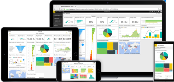
Microsoft PowerBI is an excellent tool for use in presenting and analysing school data, allowing staff to explore and interact with data which traditionally may be locked away in complex and very flat spreadsheets.

Schools have access to a massive amount of data.   This includes information about each student, academic data from assessment and testing, or from professional judgments made by teachers.    Secondary schools will also have baseline data such as the Centre for evaluation and monitoring (CEM) MIDYIS or ALIS data.   You will have data on attendance and on where students have been acknowledged for their efforts, or where they have had to be warned regarding poor effort or behaviour.  The above only scratches the surface of the available data.   For me this has long been a challenge in that all of this data is usually in difficult to read spreadsheets, where without well developed skills in using excel for example, trends and patterns will not be easy to identify. Even with well developed spreadsheet skills, attempts to analyse and interpret will be time consuming.  In addition it is often extremely difficult to bring together data sets such as looking for possible links between academic data, behaviour, attendance, etc.

PowerBI allows you to take all of this data and start exploring it.    You can create reports which present the data in simple graphical form however allow for the data to be explored.    For example you might display the count of behaviour issues by gender.   Clicking on a given gender would then filter to this gender, thereby allowing you to see other graphs such as academic performance or attendance by the selected gender, but also still showing the full cohort average, thereby allowing you to see where a particular subset of students vary from the average.

The above example shows how PowerBI displays focus on a given subset of data within graphs.  The dark pink bars relate to the selected focus whereas the light pink show dark for the whole data set.

Clicking other graphs would then allow you to easily explore other subsets of the data.   You can create reports allowing filtering by SEN status, native language, gender, subject, year and any other fields for which you have data.

PowerBI also comes with its own analytics engine which will analyse your data and identify where subsets of your data deviate from the average.     It is clear Microsoft are continuing to develop this functionality as when I first used this it identified correlations which were obvious and therefore of little use however more recently when I have used the analytics it has identified some more useful correlations.   I suspect this area will be further developed over time bringing greater potential for how it could be used.

The one drawback with PowerBI at this point is licensing.    For free you can create your PowerBI reports for individual use or can share these as files for viewing in the Desktop application complete with full editing rights however the main potential as I see it is to centrally create PowerBI reports and share them via Sharepoint so that staff can access as and when required but without the ability to change the report and without the complexity of the desktop applications interface.   You basically present them with a web page of the data for staff to interact with and explore using the graphs and other visuals and filtering provided by the person who creates the report.   For this Microsoft are currently charging a per user per month cost.      Given the potential power which PowerBI could provide to schools my hope is that Microsoft will eventually reconsider this and make PowerBI more affordable for use by schools.

PowerBI for me is about putting school data in the hands of staff in a way that is quick and easily to interpret plus usable.   It is about being able to explore data by simply clicking on individual elements and about using the data we already capture more efficiently.    With carefully crafted reports, generated through discussion with staff, the time taken to manage and analyse school data can be reduced, yet staff can be empowered to know and use the available school data appropriately.   If you haven’t tried PowerBI with you school data I would recommend you give it a try.


Thoughts from the Bryanston Education Summit

I attended the 2nd Bryanston Education Summit during the week just past, on 6th June.   I had gone to in the inaugural event last year and I must admit to having found both years to be interesting and useful.   The weather both years has been glorious which also helps to add to the event and the beautiful surroundings of the school.   Here’s hoping Bryanston keep it up, and run another event next year.

During the day I attended a number of different presentations on different topics so I thought I would share some of my thoughts from these sessions.

The first presentation of the day was from Daisy Christodoulou who was discussing assessment.    She drew a really useful analogy in comparing preparing students for their exams with preparing to run a marathon.    It isn’t something where you can jump straight into a marathon distance on day 1 of training.  You need to slowly build up your preparations, focusing on developing certain skills and approaches.   You need to have a plan and then work to this plan, although amending it as needed as you progress, should injury arise or due to weather conditions, etc.    I found myself wondering about how often we actually spend with our students in discussing this plan, the proposed goal of the subject or year and how we will all, teachers, students, support staff and others, work towards those goals.

Daisy also spent some time discussing summative versus formative assessment suggesting that the use of grades should be kept to a minimum of only once or twice per year.   My first reaction to this was concern as it seemed to disregard the potential benefits of spaced retrieval testing which ultimately would result in a score representing the number of correct answers.   Following further thought my conclusion was that spaced retrieval is very focussed on knowledge plus just indicates where an answer is right or wrong as opposed to grading which is more a judgement of students ability.   As such it may be possible to reduce overall summative assessment grading while still making regular use of testing of student knowledge.   I think this also highlights the fact that assessment and testing are actually different things even although they are often generally used as two interchangeable terms referring to the same thing.

Mary Myatt was the second presenter who discussed how we might make learning high challenge but low threat.    As she discussed Sudoku I couldn’t help but draw parallels with computer gaming.  In both case we engage, of our own free will, in a form of testing.   In both cases the key is the low threat nature of the testing.    For me the question is therefore how do we make classroom learning and assessment low threat.    Mary suggested a path towards this in discussing with students our expectations such as setting reading outside their current ability level, which is therefore challenging, but telling them this and then promising to work through it with them in future lessons.   I think this links to building an appropriate classroom culture and climate such that students feel able to share the difficulties they face and work through them with the class.  It is very much about developing an open culture and positive or warm climate in which mistakes and difficulties are not seen as something to be feared or embarrassed by, but to be embraced, shared and worked through together.   Another thing I took away from Marys session was a list of books to read;  My bookshelf will be added to with some of her recommended books shortly.

The third of the sessions which I found most useful was the session by Andy Buck.    He discussed leadership drawing a number of concepts from the book Thinking Fast and Slow by Daniel Kahneman, a book which is one of my favourites.     I particularly enjoyed the practical demonstrations where he evidenced how we all show bias in our decision making.  This is a fact of being human and the way the brain works, we bring to decision making processes assumptions and viewpoints based on previous experiences, upbringing, etc.   He also, linked to this, demonstrated anchoring, managing to influence a whole room of educational professionals to get a question in relation to the number of Year 11 students in the UK wrong.   Statistics suggest that a percentage of the audience should have got this question correct based on a normal distribution of responses however using anchoring Andy influenced the audience away from the correct answer.   I have since used a very similar approach in a lesson with Lower 6 students to show how easily I can influence their answer and to suggest that Google, Amazon, Facebook, etc. with their huge amounts of data on individuals may therefore be able to influence individuals to a far greater extent.

There was also a presentation on VR in education which has opened my mind up a little to the possible applications of VR.   This might therefore be something we experiment with at school in the year ahead.

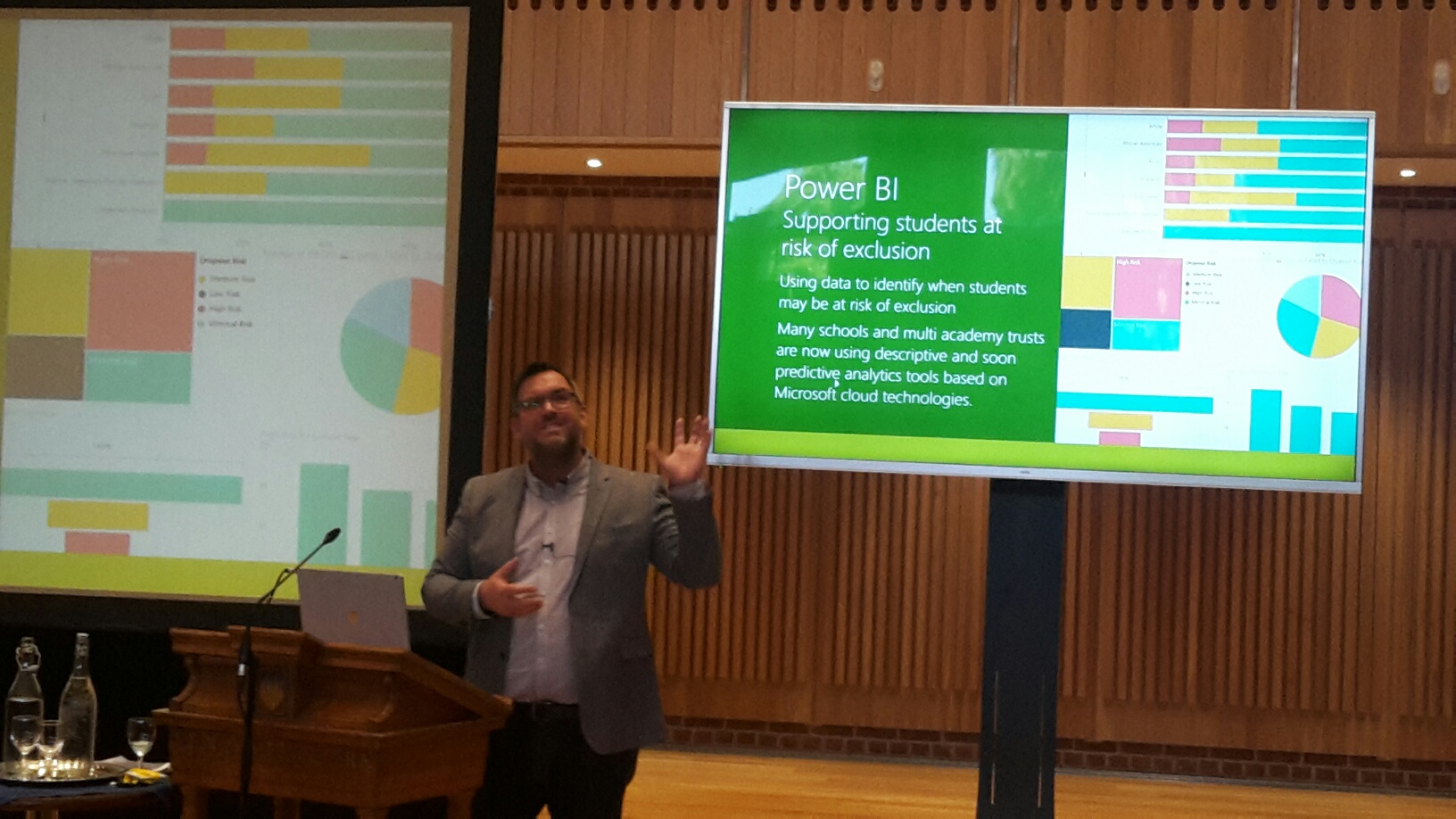
Microsoft’s Ian Fordham presented on the various things Microsoft are currently working on.   I continue to find the areas Microsoft are looking at such as using AI to help individuals with accessibility and in addressing SEN to be very interesting indeed.   I also was very interested by his mention of PowerBI as I see significant opportunities in using PowerBI within schools to build dashboards of data which are easy to interrogate and explore.    This removes the need for complex spreadsheets of data allowing teachers and school leaders to do more with the data available however with less effort or time required.    I believe this hits two key needs in relation to the data use in schools, being the need to do more with the vast amounts of data held with schools however the need to do it in a more efficient way such that teachers workload in relation to data can be reduced.

I also say a presentation by Crispin Weston on data use in school.    His suggestion that we need to use technology more to allow us to more easily analyse and use data is one I very much agree with.   This partly got me thinking about the Insights functionality in PowerBI as a possible way to make progress in this area.   He also talked about causation and correlation suggesting his belief that there is a link between the two and that the traditional call that “correlation is not causation” is in fact incorrect.   At first I was sceptical as to this however the key here lies in the type of data.    Where the data is simple and results in a simple linear trend line the resulting reliability of an argument that correlation equal causation is likely to be very low.   The world is seldom simple enough to present us with linear trends.    If, however the data over a period of time varies significantly and randomly and the second data element follows this however the reliability that correlation equals causation is likely to be significantly higher.     I think the main message I took away from Crispins session was to take data and findings with a pinch of salt and to ensure that context is taken into account.  If it looks simple and clear then there is something which hasn’t been considered.

Overall the day was a very useful one and the above is a summary of just some of the things I took away.   I must admit to taking 5 or 6 pages of tightly written notes, hastily scribbled on an iPad during the course of the day.

I hope that Bryanston decide to repeat the conference next year and is the quality of presenters and their sessions continues, that it becomes a reliable yearly event.   Here’s hoping the trend of good weather also continues should they decide to run the summit again next year.


PowerBI and School Data

Ever since I started playing around with PowerBI I have found it to be very useful indeed and I must admit that I am most likely only scratching the surface.

I came to experiment with PowerBI to try and address some issues I see with data management.    School data is often presented in colour coded spreadsheets showing student performance against baselines for example.   Different sheets are used to present different views on the data such as showing the performance by subject, by gender or the performance of students by SEN status or by EAL status.   Each additional view on the data, of which there are very many, presents us with another sheet of data.  The data is often presented as flat tables of figures however in some cases may involve pages upon pages of different graphs and charts each showing different views on the available of data.   The logic here being that each additional view on the data gives us more data that we can interpret and therefore a greater opportunity to draw insightful conclusions and from there develop actions.   I believe the reality is the reverse of this.

My belief is that teachers and heads of department don’t have a lot of time to analyse and interpret data, and therefore presenting them with so much data is counterproductive.  Having so many different views on the data presented at once also is difficult to process and to understand.   This in turn leads to either ignoring the data altogether or to giving it only a very cursory glance.   For those that love data it may lead to excessive amounts of time spent poring of the data, to data overload, where time spent planning actions, as opposed to analysing data, would be more productive.    As such I subscribe to the belief that “less is more”.

This is where PowerBI comes in.    PowerBI allows me to take my mountains of spreadsheet data and present it in a very easy to digest graphical format where each of these graphs and charts are interactive.    In PowerBI rather than one sheet by subject and another sheet for gender based data, you have just one set of graphs and charts.   You would just click on a gender or select a gender and all the graphs will change to show the results for that gender.   You might then click an SEN status to see how students who are male with SEN needs are doing compared to students on average.    This means we can combine all our different views which are normally represented by different sheets on a spreadsheet into a single set of graphs and charts.   The user then accesses the various views of the data by clicking on and through these graphs and charts.

The benefit of PowerBI is the ability to dynamically manipulate and explore the data by clicking through various graphs and filters.   You develop an almost tangible feeling for the data as you explore through it.   This is something that flat spreadsheets, even if graphs are included, lack.   Also, as you have less to look at, in one set of graphs rather than pages and pages of them, you have more time to explore and engage with the data.

The one current drawback to PowerBI is simply cost.   It is free to use as an individual both web based or via a desktop application, and you can share via sharing desktop app developed BI files however if you want to share via the web platform or if you wish to publish internally via SharePoint you will need a Pro license for each user.    Where you are sharing with a large number of users, even at educational pricing, this can become expensive.   Hopefully this is something Microsoft will be looking at and can resolve in the near future.

Schools continue to be sat on mountains of data.    PowerBI is a tool which allows us to present this data in a more user-friendly form which then allows it to be easily explored and manipulated, allowing more time to plan actions and bring about continuous improvement.  If you haven’t already done so I definitely recommend putting some of your school data in PowerBI and having a play with its capabilities.

School Data: The tip of an iceberg

Schools gather a wealth of data in their everyday operation, everything from attendance information, academic achievement, library book loans, free school meals and a wide range of other data.    We use this data regularly however I think we are missing out on many opportunities which this wealth of data might provide.

The key for me lies in statistical analysis of the data looking for correlations.     Is there a link between the amount of reading a student does as measured by the number of library loans and their academic performance for example?     Are there any indicators which might help is in identifying students who are more likely to under perform?

The issue here is how the data is stored.   A large amount of the data is stored in tables within our school management system however no easy way exists in order to pull different data together in order to search for correlations.    I can pull out data showing which students have done well, which subjects students perform well in, etc. however I can’t easily cross link this with other information such as the distance the student travels to school or their month of birth.    Some of the data may exist in separate systems such as a separate library management system, print management system and catering system.    This makes it even more difficult to pull data together.

A further issue is that the data in its raw format may not make it easy for correlations to be identified.    Their postcode for example is not that useful in identifying correlations however if we convert this to a distance from the school we have a better chance of identifying a correlation.

In schools we continue to be sat on an iceberg worth of data although all we can perceive is that which lies above the water.   We perceive a limited set of possibilities in terms of what we can do with the data.    Analysing it in terms of pupil performance against baselines with filtering possible my gender, SEN status and a few other flags however given the wealth of data we have this is just the start of what is possible.    We just need to be able to look below the water as the potential to use the data better and more frequently is there, and in doing so we may be able to identify better approaches and more effective early interventions to assure the students in our care achieve the best possible outcomes.

Data: Making better use?

One of my areas which I want to work on over the next year will be that of Management Information.   In my school as in almost all schools we have a Management Information System (MIS), sometimes referred to as a SIS (School or Student Information System).    This systems stores a large amount of student data including info on their performance as measured by assessments or by teacher professional judgement.    We also have data either coming from or stored in other data sources such as GL or CEM in relation to baseline data.   These represent the tip of the iceberg in terms of the data stored or at least available to schools and their staff.

Using the data we then generate reports which do basic summaries or analysis based on identified factors such as the gender of students, whether they are second language learners of English, etc.  Generally these reports are limited in that they consider only a single factor at a time as opposed to allowing for analysis of compound factors.   So gender might be considered in one report and then age in another, but not gender and age simultaneously.   In addition the reports are generally reported in a tabular format, with rows and columns of numeric values which therefore require some effort in their interpretation.    You cant just look at a tabular report and make a quick judgement, instead you need to exercise some mental effort in examining the various figures, considering and then drawing a conclusion.

My focus is on how we can make all the data we have useful and more usable.    Can we allow staff to explore the data in an easier way, allowing for compound factors to be examined?    Can we create reports which present data in a form from which a hypothesis can be quickly drawn?    Can the data be made to by live and dynamic as opposed to fixed into the form of predetermined “analysis” reports?   Can we adopt a more broad view of what data we have and therefore gather and make greater use of a broader dataset?

I do at this point raise a note of caution.   We aren’t talking about doing more work in terms of gathering more data to do more analysis.  No, we are talking about allowing for the data we already have to be better used and therefore better inform decision making.

I look forward to discussing data on Saturday as part of #EdChatMeda.    It may be the after this I may be able to better answer the above questions.